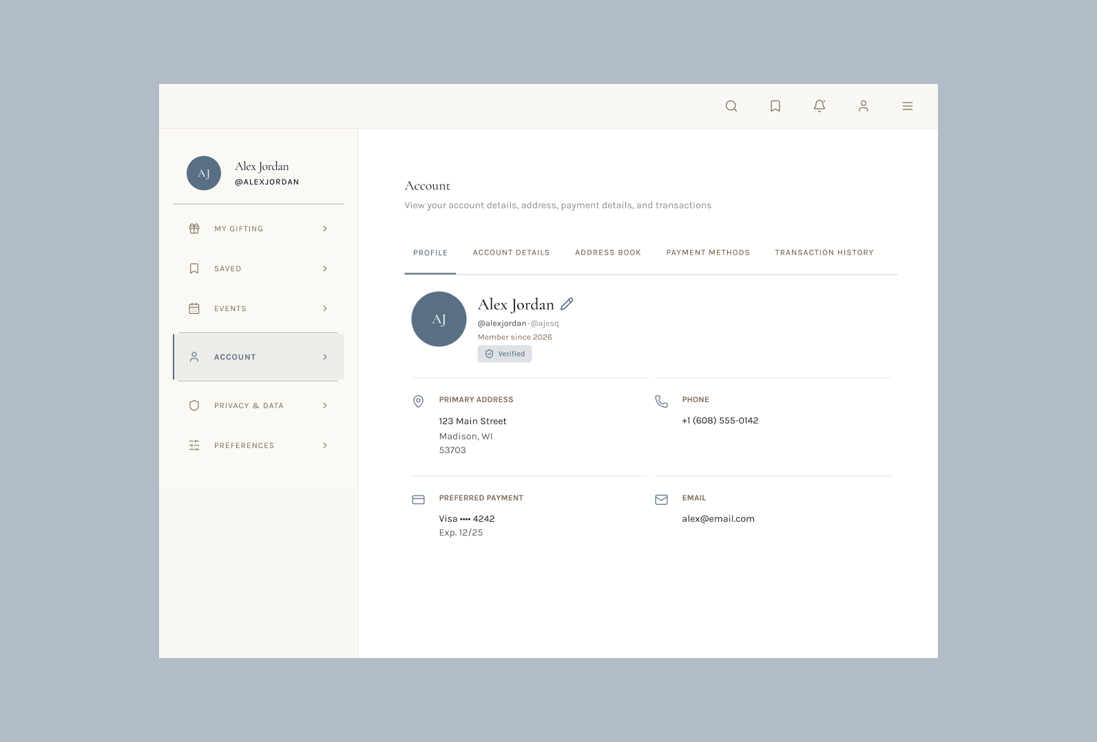
Creating an account hub for a luxury gifting platform.
I worked as a product designer at a luxury gifting startup. This platform provides luxury shoppers with a place to discover, curate, and send high-end gifts to the people in their lives. This is a stealth startup, so the company name is withheld.
My Impact
34% increase in overall SUPR-Q score after redesign (3.3 → 4.4). Trust dimension nearly doubled. 0-to-1 feature defined, prototyped, and handed off to developers in 8 weeks.
Background
The platform we created needed a comprehensive account management screen. I needed to create this screen from 0-1, covering profile details, address management, payment details, and gift history.
A core element of the account details page I focused on highlighting was trust, given that this is a luxury platform and extremely expensive transactions occur here, building user trust was my top priority.
This role stretched beyond pure product design. I also defined the product vision by writing and iterating on PRDs alongside the design work, and vibecoded a working prototype to hand off to the engineering team, giving them something they could actually implement.
Market Research
To kick off my research process, I audited account pages across four luxury competitors: Flamingo Estate, Chanel, Bottega Veneta, and Prada, and found two overarching issues within all of these sites.
No visual hierarchy
Important actions, empty states, and navigation links all competed for attention. The user was never directed to a starting point on the page.
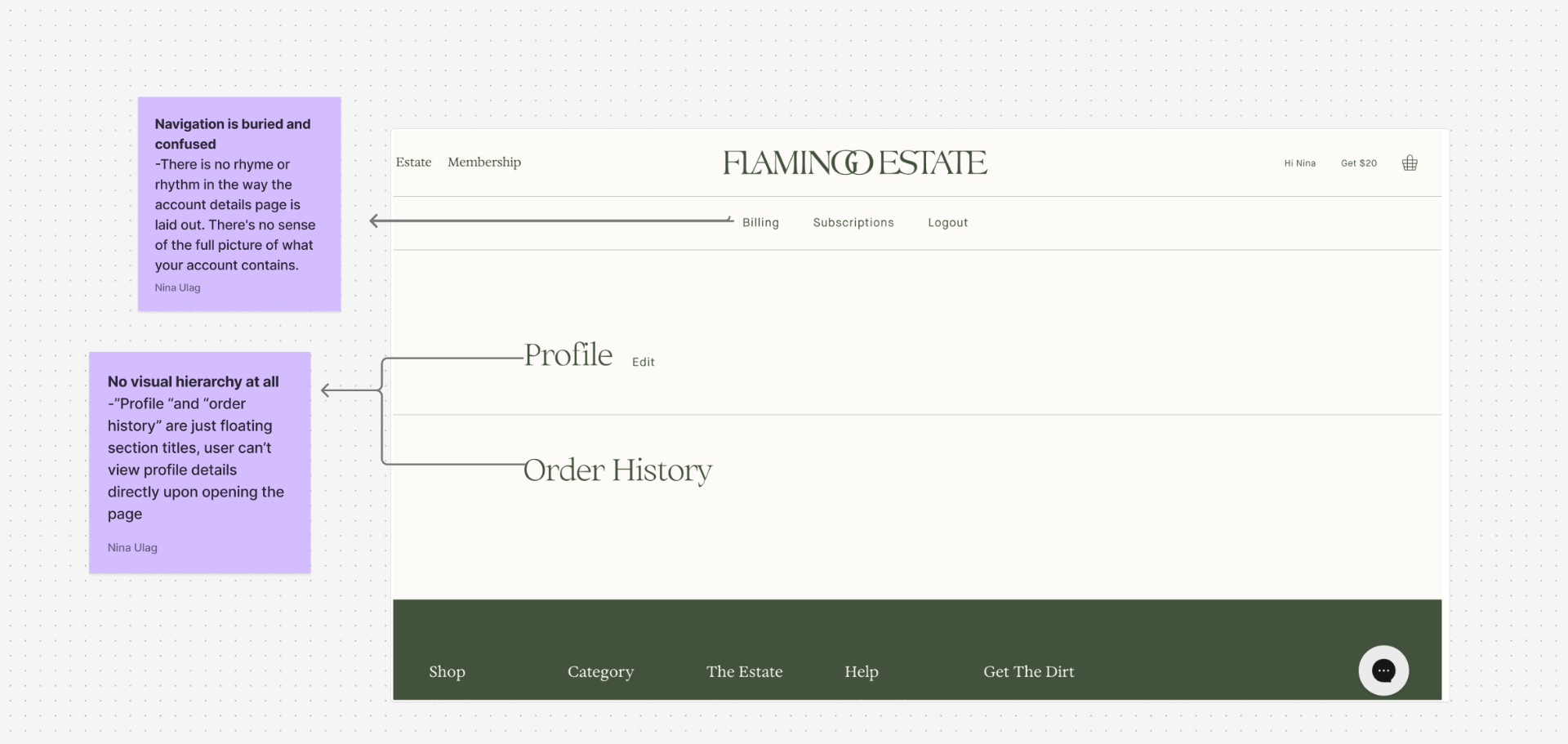
Arbitrary organization
Information was grouped in ways that didn't make sense. Crucial account actions were buried or split across pages with no clear logic connecting them.
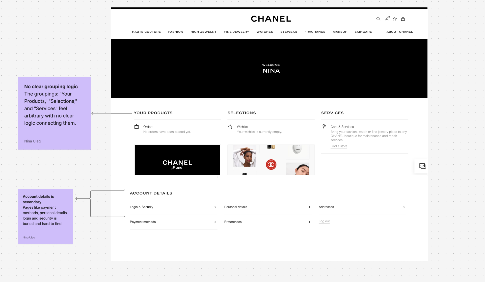
After reviewing these sites, I had a clear design direction: build something where users always know where they are, where to go next, and can find anything without having to think twice.
Initial Design
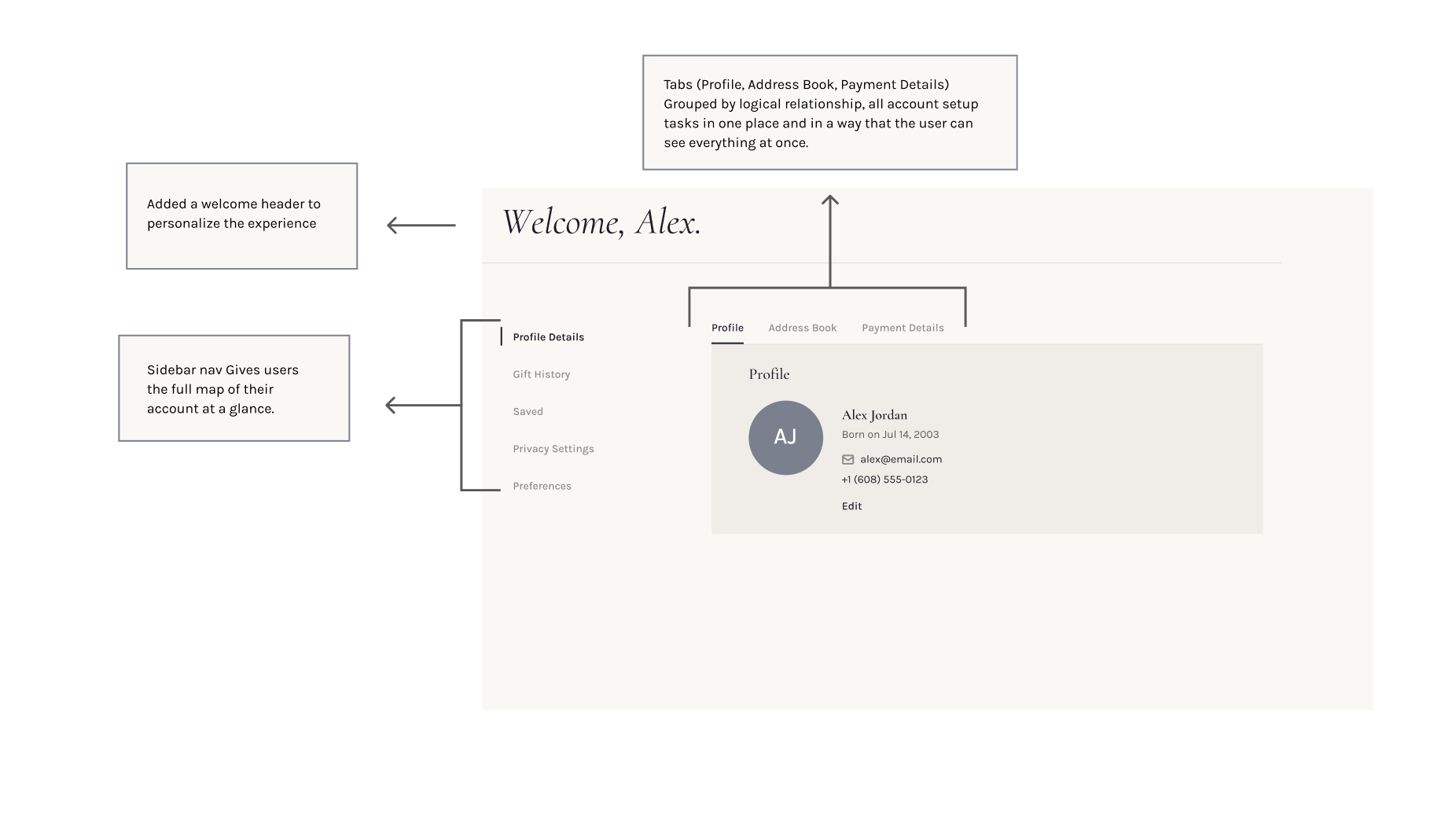
Based on those gaps, I designed a lo-fidelity version with a clear sidebar nav, a personalized welcome header, and tabbed sections grouping Profile, Address Book, and Payment Details. The main focus at this phase was ensuring clarity and hierarchy.
Profile Details
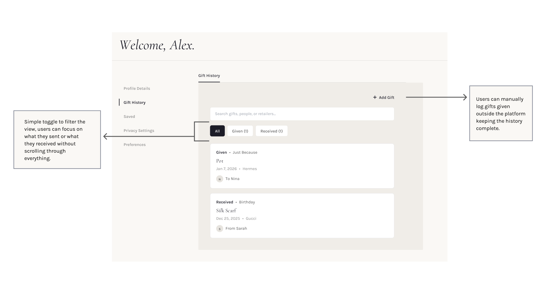
Gift History
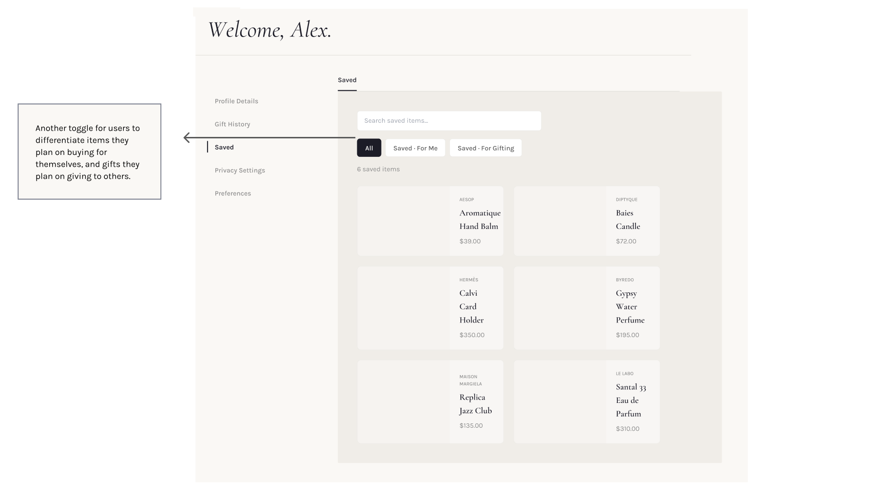
Saved Items
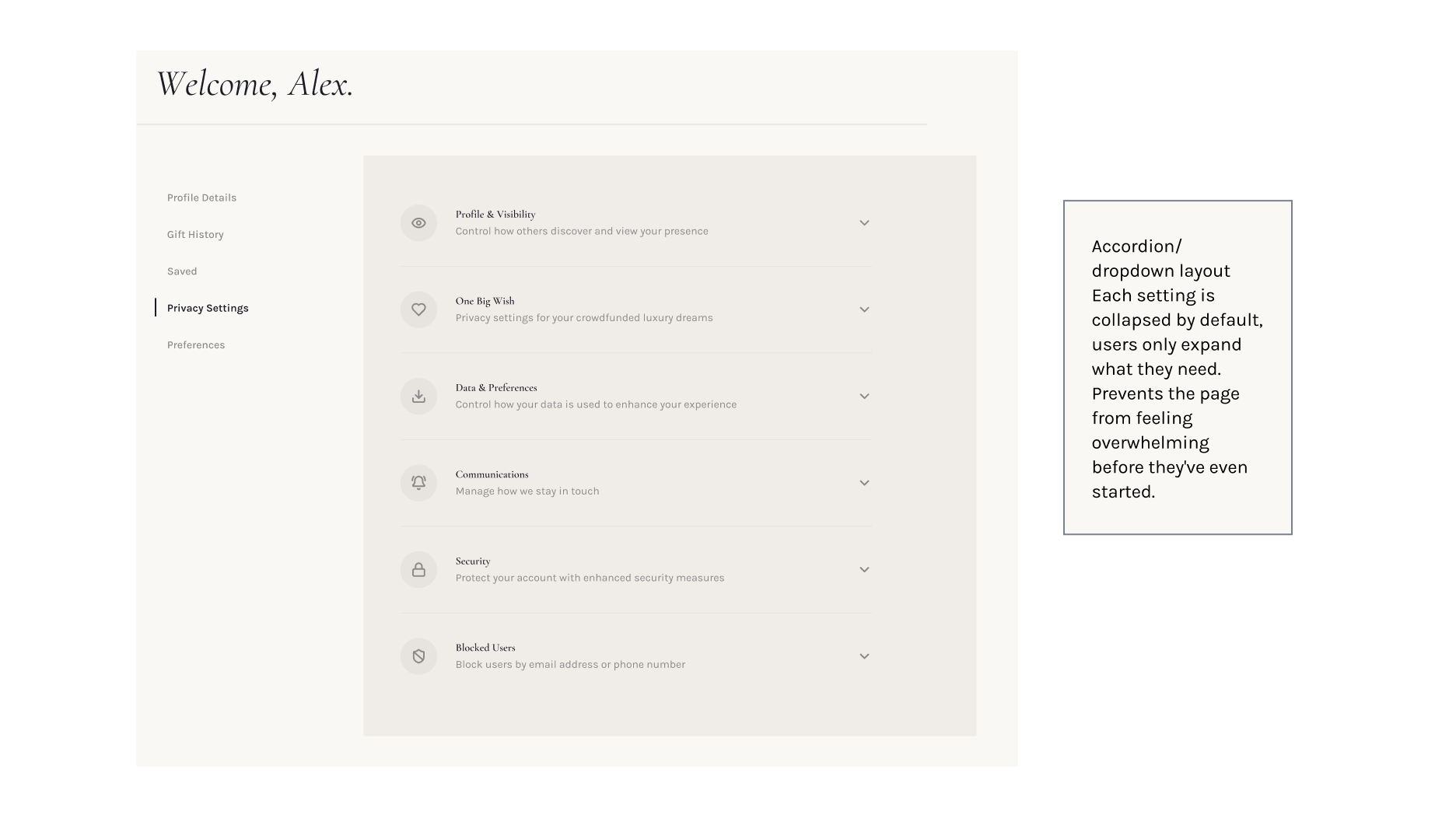
Privacy Settings
User Research & Insights
After completing the initial lo-fi designs, I conducted a research round with a focus group of four frequent luxury shoppers and former luxury industry professionals. I collected both qualitative data through structured interviews and quantitative data via a SUPR-Q survey to numerically assess how users felt while using the account details page.
Three core problems surfaced.
The forms were exclusionary
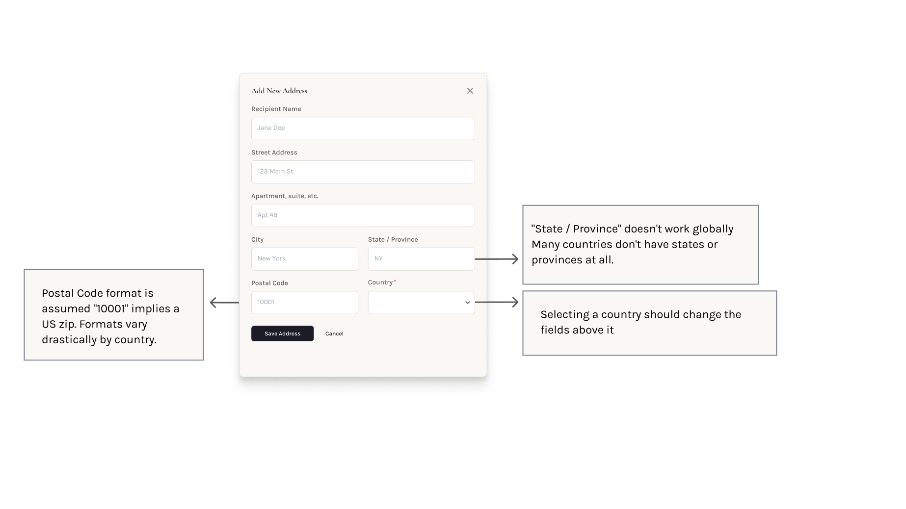
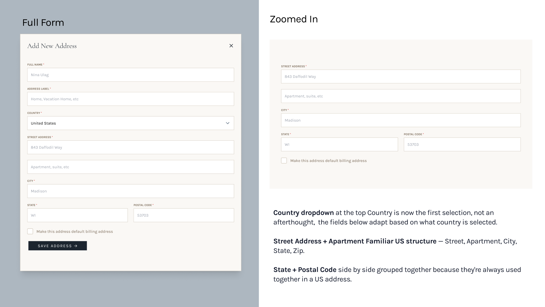
The address field was designed only for US users. After speaking with luxury shoppers, many noted that most are based in Europe and that shipping gifts across borders is very common in luxury spaces. This became the most glaring change I needed to make.
Identity verification and editability were in direct conflict
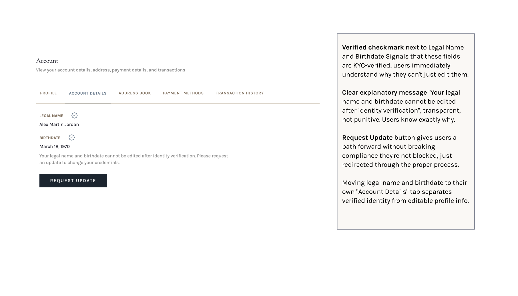
When users sign up, they go through KYC identity verification with Stripe. That means their name and date of birth are tied to a verified identity, so they shouldn't be able to change them at will. Stakeholders flagged this directly, noting that the existing design failed to meet compliance requirements.
Users told me something similar: they wanted to feel the platform was secure. In the luxury world, due to the high-value transactions that occur, trust and a sense of security around their information are central to whether users will use the platform. Making users aware of the platform's identity verification processes would build that trust.
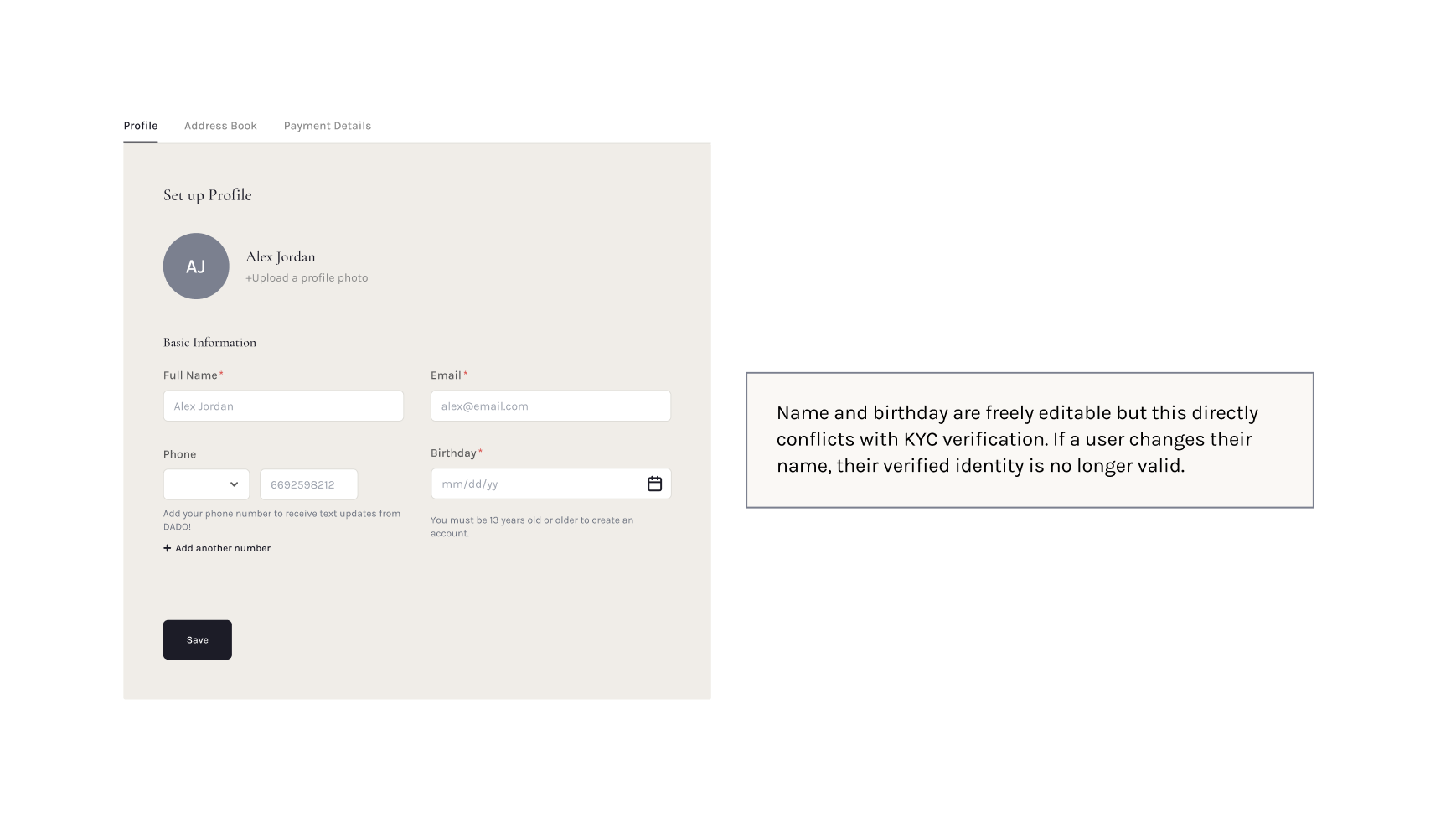
The account page had no soul
An overarching piece of feedback was that account details should serve more as a hub for users to view all their gift activity, and it should feel more personalized. At lo-fi, the account details felt bare-bones and transactional. It needed to feel more personal.
Design Decisions
Internationalizing the forms
My solution was a country selector that dynamically adapts the address format based on the user's location.
US format
International format
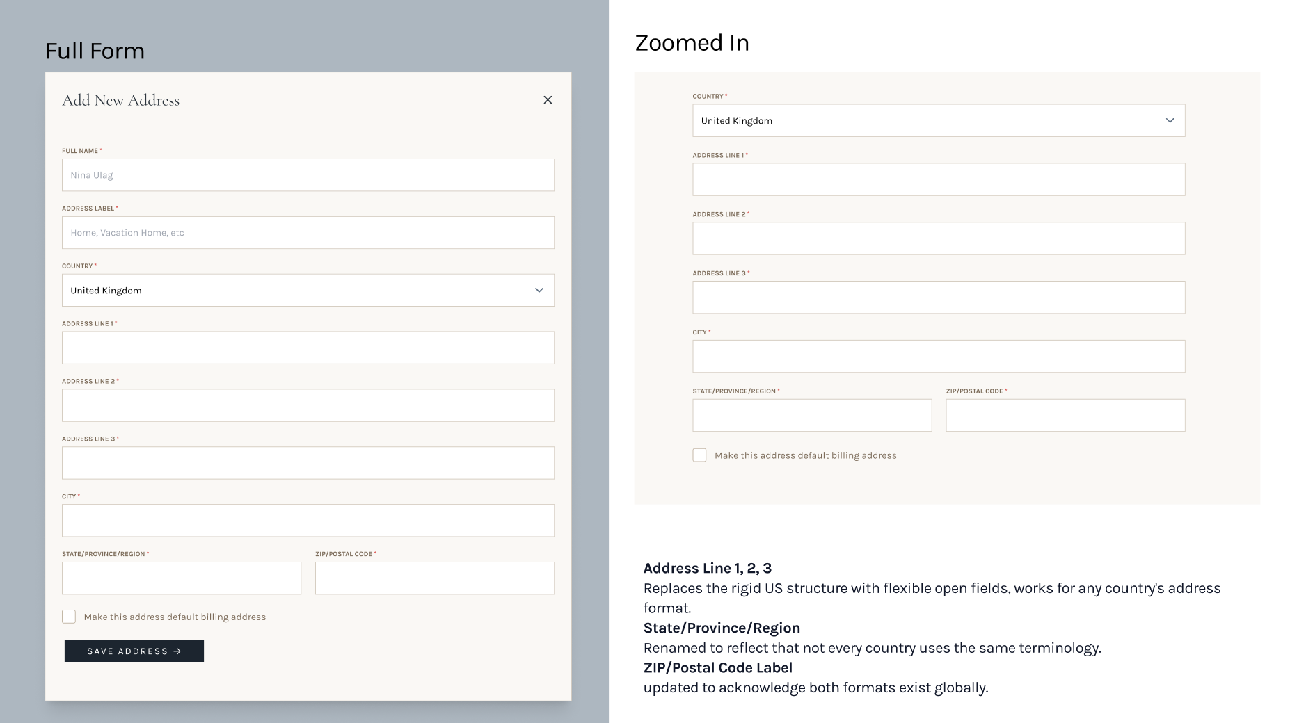
- Country SelectorAdded a country selector above the address fields that dynamically updates the format based on the user's location. Selecting the US shows a US-optimized layout; selecting any other country switches to a flexible format that works across regions.
- Address labelsUsers can name their addresses (Home, Vacation Home, etc.), making it easy to manage multiple addresses across countries.
- Default billing & shipping address checkboxesUsers can set separate defaults, important for a gifting platform where buyer and recipient are often in different locations.
Designing around the KYC constraint
In typical "edit profile" flows, users expect to be able to edit their name and date of birth. But KYC verification through Stripe means changing those fields requires repeating the KYC process. I needed a design that made this feel informative rather than punitive.
My solution was to lock the name and birthday fields and add a tooltip on hover: "You must request to update your name or birthday." I kept the fields visible and the information accessible, but signaled that a process was involved in changing this information. The actual request flow was out of scope for this feature, so I focused on the steps leading up to it.
Locked fields with tooltip
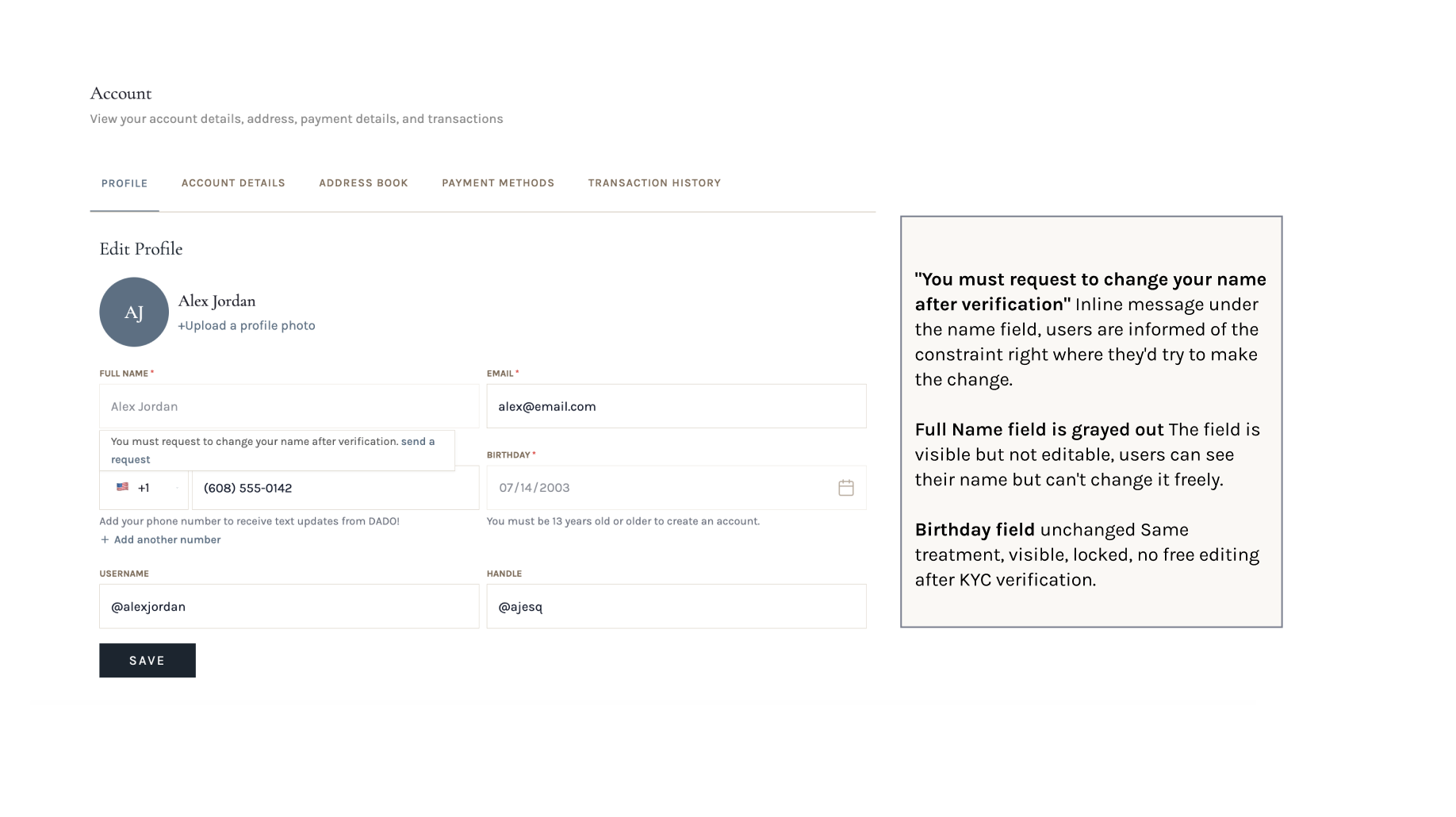
I also created a dedicated "Account Details" section under Profile with KYC information (Name, DOB), and added a "Request update" button to make this path as readily available as possible.
Account Details with Request update flow
Rebuilding the account page as a gifting hub
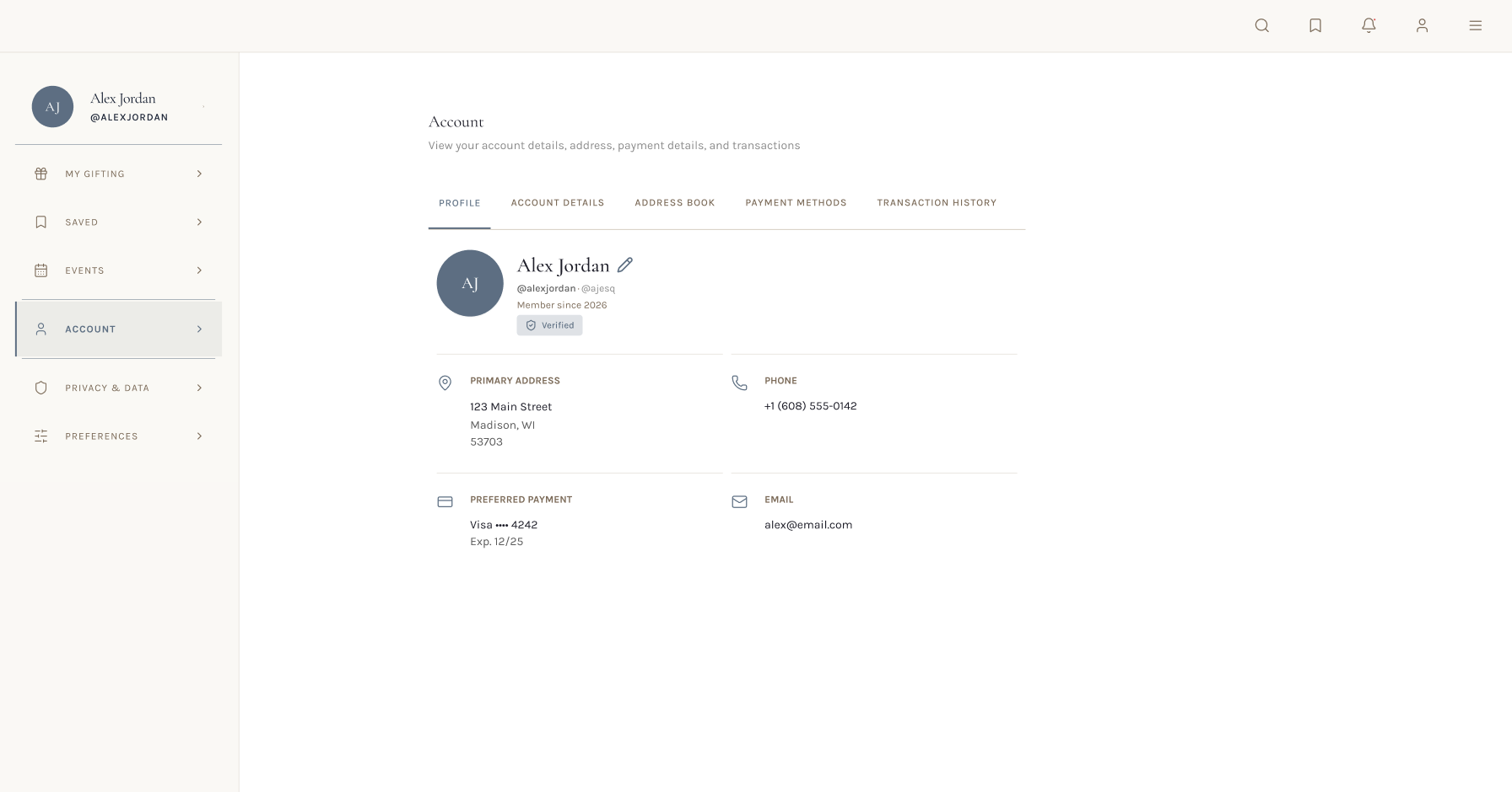
The original page was a simple sidebar with five items. The redesign introduced a full left navigation bar and organized sections, making the account pages feel like a real, personalized hub, with a new color and font scheme that met WCAG accessibility guidelines while creating a more elevated, luxury feel.
My Gifting
A centralized activity hub where users can track and manage their involvement across the platform's gifting features. (Full section redacted under NDA.)
Events
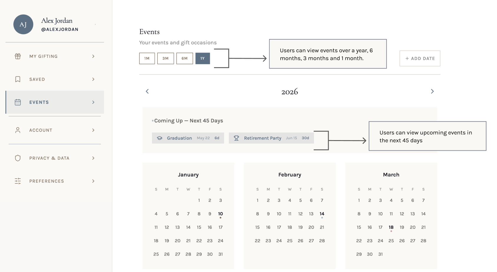
A new section to track upcoming occasions and gift deadlines, with a calendar view, list view, and a "Coming Up" strip for events users need to remember. Added based on user feedback to make the account feel more personalized.
Transaction History
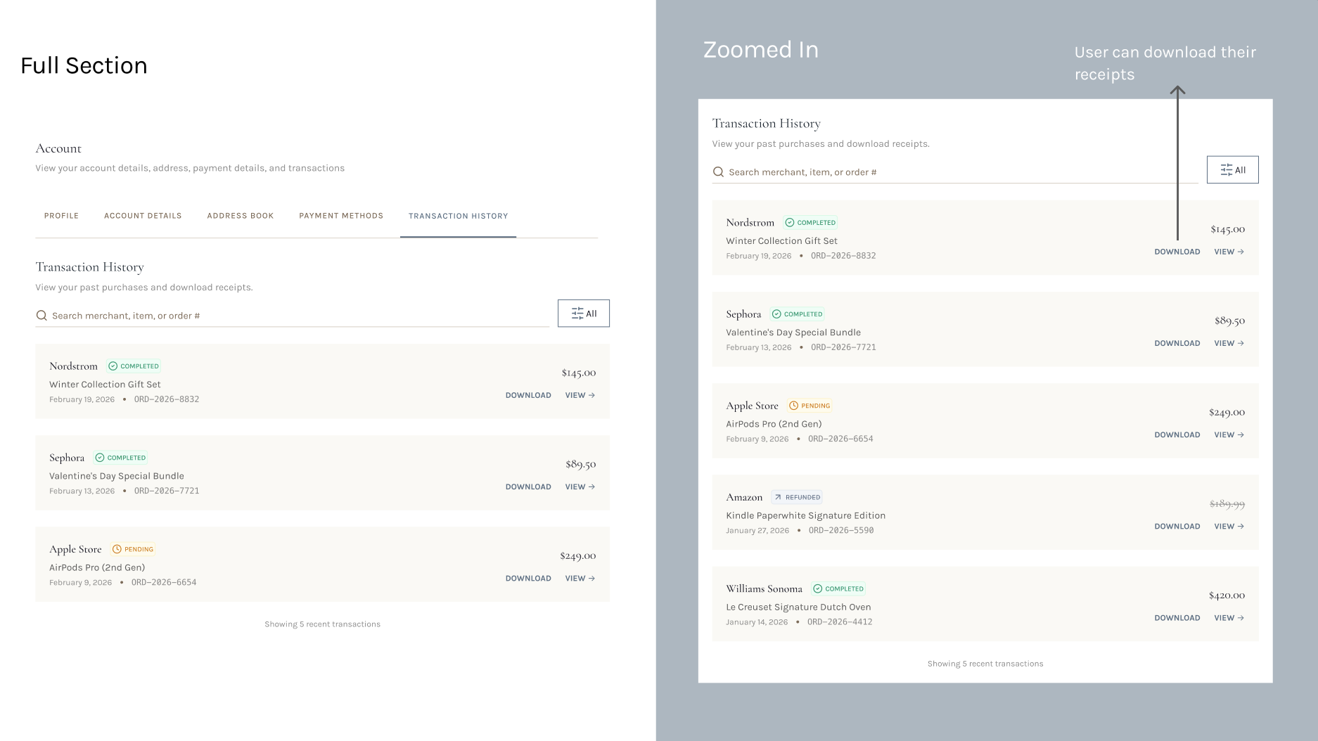
A searchable log of past purchases with order numbers, merchant names, status badges, and the ability to download receipts. Users specifically mentioned needing a place to view all transactions in one spot.
Gift History becomes its own feature
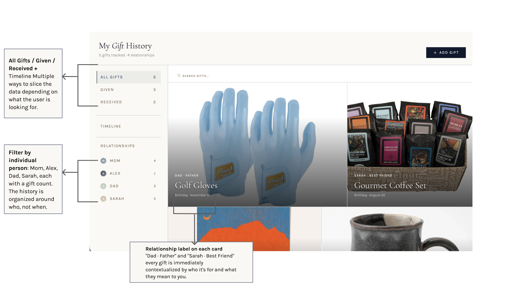
Midway through the redesign, it became clear that Gift History had outgrown the account details page. To keep it relationship-focused, we moved it into its own section.
I added a left nav that lets users filter by all gifts, given, and received. Users can also click into individual relationships to view their full gift history with that person. Each card shows the name of the giver or receiver, the gift title, the occasion, and the date.
Outcome
Once I had redesigned the feature, I re-ran the SUPR-Q survey across the same users to measure the impact. The overall score rose 34.6% (3.29 → 4.43), with every dimension improving.
The most significant shift was in Trust, which nearly doubled from 2.25 to 4.63, a direct reflection of the work done to design a clear, reassuring identity verification experience through the KYC integration.
What I Learned
Working on this 0-to-1 taught me a lot about making major design decisions with minimal guidance. It also taught me a lot about utilizing vibecoding tools for rapid iteration. I designed the lo-fis in Figma, iterated on them in Magic Patterns, and made finishing touches in Cursor, which let me present a working prototype to the team in a form they could actually implement.
The KYC constraint was the biggest design lesson I took from this project. It was my first time designing around an internal compliance requirement, and my initial instinct was to hide or minimize it. What I landed on instead was making it transparent, locking the fields, explaining why, and letting the user feel informed rather than blocked. That shift, from hiding a constraint to designing around it honestly, is something I'll carry into every project going forward.
My other projects
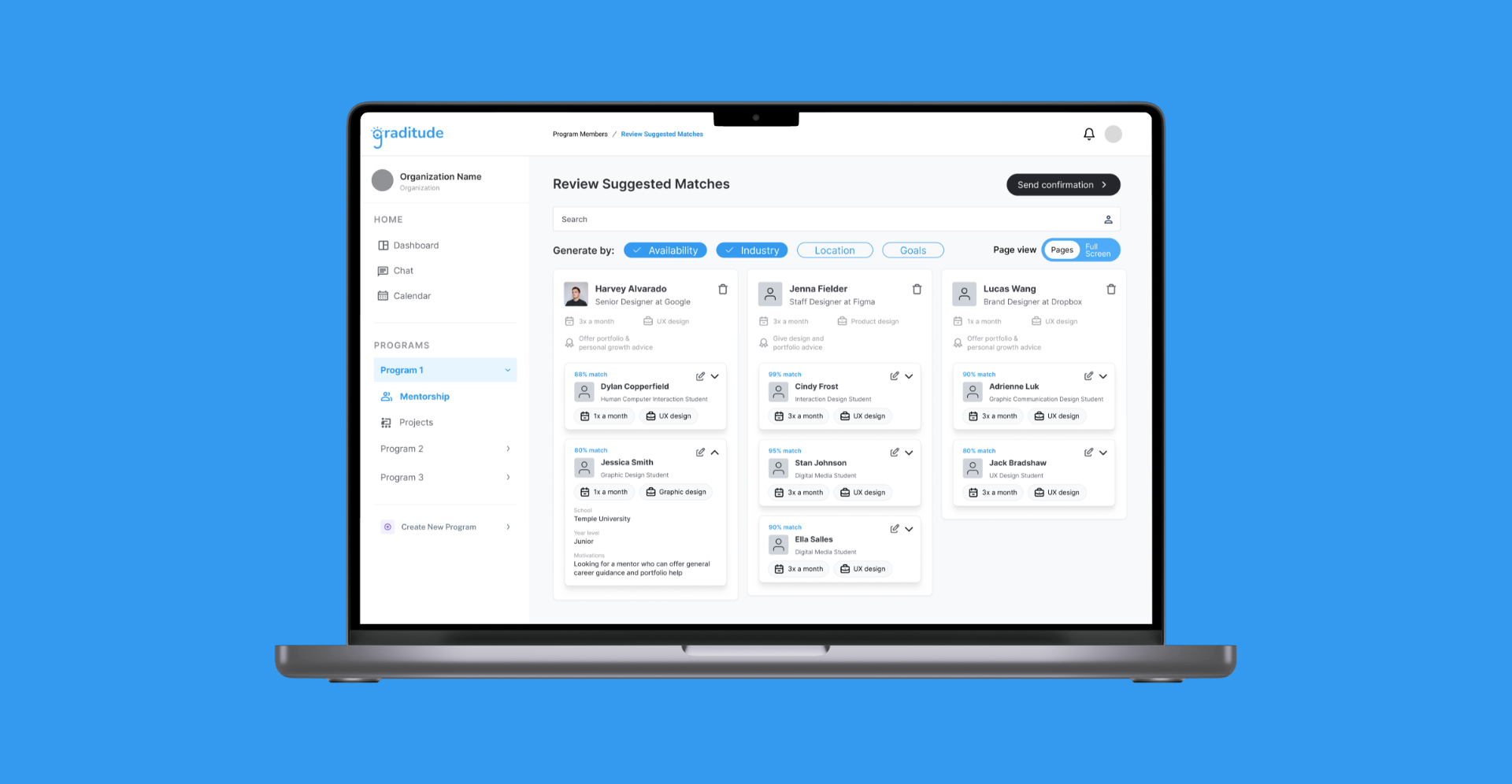
An AI-assisted solution for creating authentic student mentorship connections.
Built a scalable, 0-1 feature for matching student mentees with alumni mentors and a match database to keep track of mentor/mentee connections.
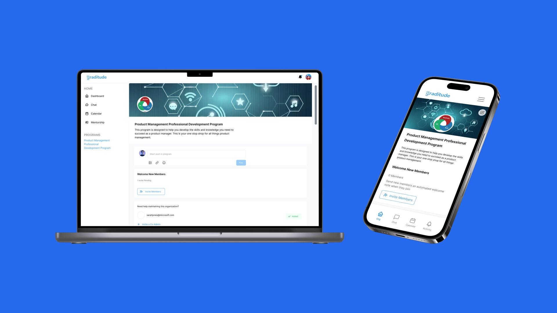
Empowering student leaders to spark networks.
Designed & launched a 0-1 user flow for Graditude's organization join & creation feature, enabling student leaders to build and manage mentorship-driven communities.